


What Value is Color?
Value, chroma, color wheels and exploration of color in digital art

How do I know what values are the colors I’m putting down on a canvas? How do I plan the colors and values of my paintings? Why do I fail at painting using the black-and-white-to-color approach? How are value and color connected?
I learned that chroma is the answer to all of these questions.
What is chroma?
Chroma is the purity of a color or its strength. Other sources also call it intensity or ‘the perceived amount of difference from a grey of the same lightness (value.)’ What that means is how distinct the color is from its gray. Not to confuse with saturation, which also affects brightness.

Here’s another simply put example. Yellow can be highly saturated at a dark value but it’s not yellow anymore, we perceive it as brown, don’t we? If we took gray pigment and gradually added pure red to it, we would be increasing the chroma of the mixed color with every iteration.

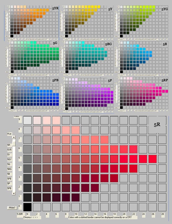
Doesn’t this swatch arrangement remind you of something?

The term chroma (Greek for "color") was introduced by Albert H. Munsell as a dimension of his Munsell system. He based his color theory on what he defined as “perceived equidistance” — the human visual system’s perception of color.
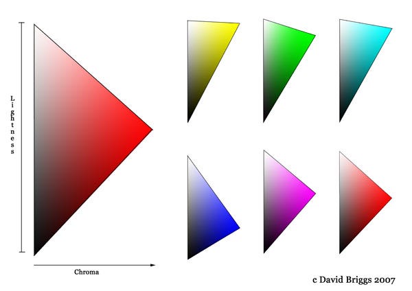
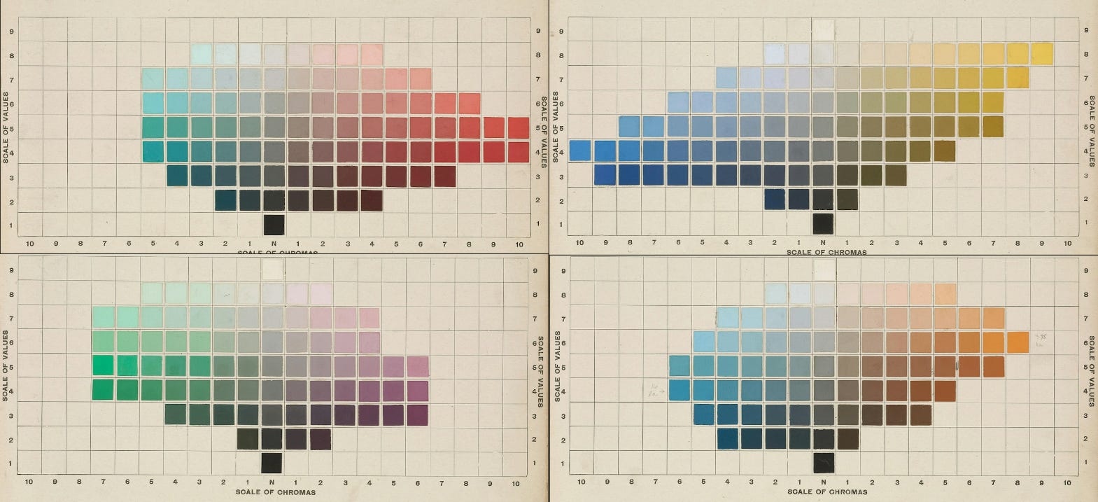
The system specifies every color using hue, value (or lightness), and chroma. In the previous diagrams, we only saw value and chroma together. But what if we add hue to the mix?

What we got also represents a color wheel in your favorite drawing software, no matter what shape it is. You can see that the form is very uneven, you can’t call it a perfect cylinder or a cone. A simpler diagram I found is described as a tree.

So why is it uneven? It is because for each hue the chroma/value arrangement is different. Yellow, as we looked at earlier, is the strongest (has peak chroma) at a high value. Red has peak chroma at the middle value, and blues and violets have high chroma at the low value.
How does it help?
Munsell System tells us that for each value there’s a predetermined set of colors that match this value (or have the same brightness). I love this example from Devin Korwin’s Creative Fundamentals book, and I can’t say explain it better.
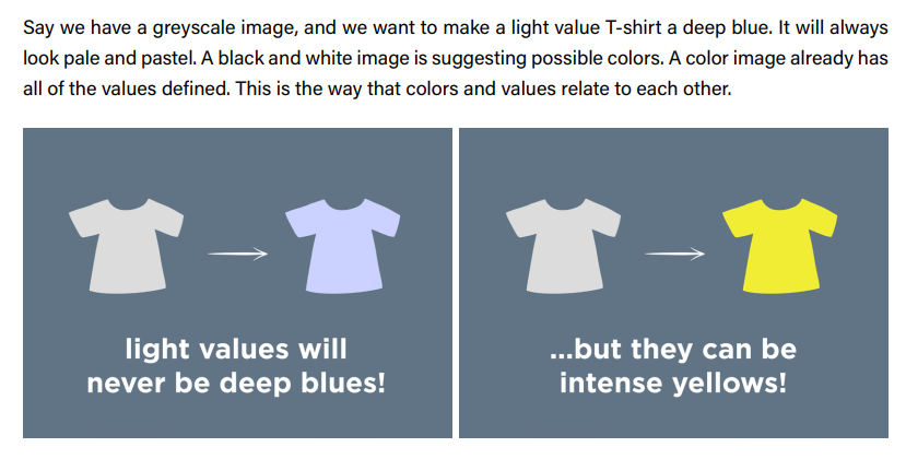
If we were to color this shirt in any hue, here are the approximate colors we would get for this value. All the colors except greens and yellows, would look washed out, or low chroma.

This is exactly the reason why your colors look dull or dirty when you color black-and-white drawing with color layer mode. It means your values don’t match your desirable chroma, and you can’t have colors without values (or brightness).

You can have a great low-key grayscale drawing (compressed dark values) but you will never achieve high chroma yellow when coloring it. On the other hand, that doesn’t mean you can’t have a color that appears yellow compared to other colors around it. Chroma is relative, similar to saturation.

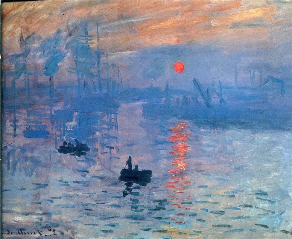
When deciding on colors and values, it helps to consider exposure and value keying. What do you want to communicate? There’s no right or wrong when it comes to choosing exposure; it’s your creative choice based on goals and preferences. For example, if I were to paint a vivid rainbow from the photo below and have it look natural, I would likely choose a low or middle key.

You might choose to push your values and limit colors, or vice versa. Eric Merrell has a great blog post called Is Value More Important Than Color? where he explores the possibilities of color, and how it’s often overlooked. He also shares some of his work, which could be good examples of limiting value contrast in favor of color.
![[Eric Merrell, Self-Portrait at Sunset] Color has infinitely more possibilities than value. (Another way of thinking about that: color reflects our full experiences; value is a reduction of that fullness.) Although here we see a great variety of col…](https://substackcdn.com/image/fetch/$s_!Waho!,f_auto,q_auto:good,fl_progressive:steep/https%3A%2F%2Fsubstack-post-media.s3.amazonaws.com%2Fpublic%2Fimages%2F8c81b112-8c42-4b0b-ad10-e735138a6b99_1432x864.jpeg "[Eric Merrell, Self-Portrait at Sunset] Color has infinitely more possibilities than value. (Another way of thinking about that: color reflects our full experiences; value is a reduction of that fullness.) Although here we see a great variety of col…")
When practicing value keying, doing 3-value studies was especially beneficial, expanding later to 5-value studies. It taught me to see value relationships clearer compared to copying values exactly as I see them. Let’s do an experiment with value keys. I did studies of the same portrait by Eric Merrell while interpreting it with different value groups.

A is focused on exposing lights with 3 values in a high key (compressed light values), B is 5 values focused on shadows, middle-low key (values are 20-50 on a 0-100 scale). Both communicate the same information: a man with a beard wearing a v-neck and a cap. So which one is ‘better’? I added chroma and hue from the original painting to compare more.

Which one do you like best? B looks fine to me but not as vivid as the original, A is washed out because blue, violets, and pinks have low chroma at light value.
If I were to paint the same portrait from the beginning knowing I wanted high chroma pink-violets and cyan-blue, a solution could be to pick compressed mid to/or low values, as Eric Merrell did with his painting being very limited middle values. But then again, all of these have a different feel to them. It only shows us how many choices there are when it comes to color and value.
side note
For the last example, I used brightness layer mode (which works the same as color mode but for value) to save time, and the results aren't completely accurate. Unlike the Munsell System, the RGB color model and HSV color space, used in most software today, were designed for monitors, so they don't represent our color perception in its complexity.
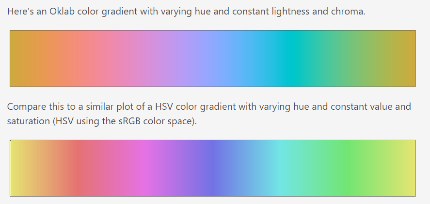
For instance, if you try to make a gradient of all hues with the same brightness in Photoshop, it will give you a result similar to the second gradient in this example. The gradient is quite uneven and there are clear differences in lightness for different hues. Yellow, magenta, and cyan appear much lighter than red and blue.
That can make any grayscale-to-color (or vice versa) manipulation slightly misleading if you’re unaware of this nuance.
What do we do about that?
use a grayscale thumbnail as a guide or reference instead of coloring it (still need to consider chroma)
learn to match chroma and value manually
use software with a perceptual color model or one close to it, like Krita (has HSY and HSI), or Heavypaint. Rebelle has a system for manipulating color and mixing that emulates traditional pigments like no other software if you’re into that.
Future-me note: I found an OKLAB color wheel plugin for Photoshop! (it’s free)
Remember the earlier diagram of sRGB hues arranged by chroma and lightness? Each hue looked like a different triangle. These hue triangles were stretched out to fit the color wheel shape, which means that to increase the chroma of any given value, we have to go diagonally instead of horizontally in a square color wheel.

Applying that, we can get a sense of what value a color is. Squinting your eyes can greatly help with direct comparison and training the eye, leading to better intuition that could be useful with any medium.

This establishes a clear link between color and value, which allows for making more confident choices about color variety or arbitrary colors.
Before learning chroma, I couldn’t wrap my head around using the color wheel efficiently. Coming from a traditional background, having started with gouache, mixing colors came naturally to me, but not with digital. I could never get the same pigments like rich yellow ochre or olive green, and there weren’t many resources on the topic. It turns out the colors were always there, but I never learned the tool.
Practice
I mainly did grayscale to color in previous examples, so now I’ll try experimenting with direct color painting. It’s time to make color decisions.
#1
With this photo, I want to exaggerate the red-green contrast and paint strong reds for shadows, midtones, and subsurface scattering. Red has high chroma at the middle value, so I compress lights similar to Eric Merrell’s portrait. I block in the reds I want for shadows and cheek area and decide they’re accurate to compare everything to them.

Looking at the reference, I noticed how blue the cast shadow on his shirt looks, similar to the nose cast shadow. Why not use that and add some blue to the cast shadow? I can make it more saturated because blue has high chroma at low values. Sunlight also suggests warm light and cool shadows, which can make it more believable.

So this is how it went. I followed the planes of the head and curvature of the reference as much as I could to keep the value structure and match it with my colors.
#2
This time I wanted to stick to the original colors but ‘key’ the painting more armor and its lighting, emphasizing the vibrancy of it against desaturated colors in clothing and her skin.

Because the background is a contrasting salad of shapes, I compressed the values on the figure quite a bit, especially the face, making it darker overall. This way the values seem more unified to my liking and the figure reads as dark on light better.
A good exercise would be to use the same reference but ‘key’ differently. If I were to key it to her face shadows, the lights and the background would get blown out more, closer to the photo. If you’re having a hard time understanding what ‘keying’ exactly means, think like a camera. You can’t capture the sunrise and details on the window frame at the same time.
Can you have vibrant colors without sacrificing values?
Balancing chroma while using full value range can get difficult quickly with the risk of muddy or dull colors, especially if you’re jumping into it with no planning or clear idea in mind. While it can be easier to achieve more color variation with compressed values (think impressionists), it’s not the only option.
I’ve noticed two common approaches when it comes to vibrant colors, both from traditional painting and stylized digital art. The first one is using complementary colors.
#1 Complementary Colors
You’ve probably heard about it from every corner, and it’s the first thing that pops up if you google color theory, but why is that?
Ever since Isaac Newton discovered the visible light spectrum, which led to the first color wheels, it’s been known that opposing colors produce the greatest contrast based on human perception. (For more on the topic, visit the resources at the end.) Munsell followed Sir Isaac Newton’s color order, and here are complementary colors from his Atlas.
Studying the charts, I noticed that the chroma-value peaks are almost mirrored, especially with yellow and blue. An easy way to apply this is by exaggerating color temperature—cold shadows, warm lights, or vice versa. For example, red shadows and cyan-green lights, orange lights and blue shadows, and so on.
One artist who uses complementary colors well is Devin Elle Kurtz.

In many of their paintings, the temperature contrast is clearly visible, supported by the use of tertiary colors. For example, in the bakery dragon painting, all the warm red-yellow hues are against grays and blues.
The toy store scene especially caught my eye with its colors. The smart choice of color and value allows for plenty of high chroma colors along most of the value range. As an exercise, I color-picked the painting and tried to arrange the colors similar to a value scale – dark to light.

While it’s not exactly accurate, it shows that all colors are saturated, with the highest chroma colors being at the focal area – inside the toy place. There are barely any grays, yet all the colors are distinguishable from each other. Maybe that balance is what having vibrant colors means. Juggling your chroma, value, and hue until it all works together.
#2 Using hue shifts to change brightness
I’ve used this approach in my gouache paintings and the earlier study in the practice section. The key is to maintain relatively high chroma when adding light or shadow.

It’s similar to something I was taught a while back – ‘never use black for shading’. Looking back, that statement meant: 'By adding black, you quickly reduce chroma, so you need to add more color’. To spice up the colors, we can change hues and match the value needed. It could be used both for arbitrary colors and to exaggerate color temperature.

Here’s an experiment: the same apple but with varying degrees of color variation. The first one is all the same hue, the second slightly varies in hue, and the third is all random. All of them work for me because of their underlying shapes and values, and then it’s a matter of taste. Yuming Li often chooses arbitrary colors that don’t always resemble reality, if you like color variety or the ‘alien’ apple.
While value can clearly communicate form on its own, adding color variation could be a cherry on top, since you can show lighting more efficiently using temperature shifts. Here’s an example of that.

Another way to add more interest is to use color shifts in the same-value planes. It could support the color-jitter-y effect and show movement despite no change in value.
It’s common to notice hue variation in skin tones due to the natural translucency of the skin. For instance, areas like cheeks or elbows appear redder due to underlying blood vessels, or the area under the eye is more blue. When painting skin, you can use these subtle hue changes to your advantage to add more liveness to the painting. As long as your colors and values support each other, it’s up to you.
Now, none of these are rules you should follow; they are my observations and experiences. If you’d like to learn about color and light, I can recommend James Gurney’s book Color and Light (it’s on the Internet Archive now!) and Marco Bucci’s YouTube channel.
If you liked the post and feel extra generous today, buy me a slice of cheese on Kofi! Thanks again!
Reads and resources:
In-depth open source on color: Dimensions of Color by David Briggs
Devin Korwin’s Creative Fundamentals books; also his public former-Twitter posts about chroma (and lots of other public resources)
Artists Masterclass Series: Color & Light book
Is Value More Important Than Color? by Eric Merrell
‘Complementary color stimuli are […] two colored lights that mix additively to make white light. Such lights have an exactly opposite direction of wavelength bias relative to daylight as detected by the human visual system.’ © David Briggs in Dimensions of Color
Opponent Process Theory; Opponent Process Theory test (scroll down). While it’s more common knowledge that our cones detect different wavelengths: red, green, and blue (trichromatic theory), opponent process theory touches upon how the brain processes these signals from the retina. Here’s in in-depth look on color vision.
Munsell Color Atlas (public domain)
Sources:
https://munsell.com/color-blog/sir-isaac-newton-color-wheel/
https://en.wikipedia.org/wiki/Complementary_colors
https://en.wikipedia.org/wiki/Munsell_color_system
https://munsell.com/about-munsell-color/
Very helpfull!! thank you